On Thursday, I showed my tutor my personal website and got some feedback and areas for improvement. First of all, in the layout of the website, some widgets unrelated to personal portfolio, such as calendar, were added to the sidebar, which were redundant in the display of the website.
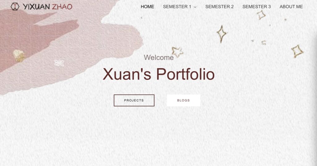
Second, the choice of font on the main page is not formal enough, which is not suitable for the overall presentation of the website.
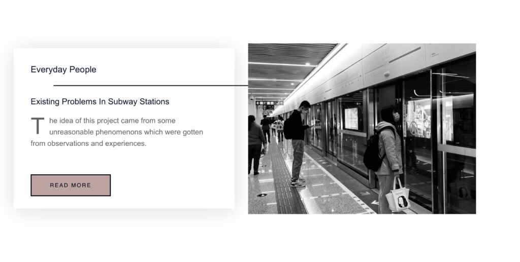
Third, in the display of website content, because of the addition of sidebar makes the text scope space becomes limited, the project and blog text readability is poor.
The navigation of the site is clear, but the functionality is a bit repetitive.The project navigation bar should highlight the key points. Figure out what you want to show the audience.
Updated
Based on the feedback, I made changes to the site, first by eliminating widgets and sidebars and making the body content more readable. Modified the font for the home page. A project description is placed at the beginning of each project. Some duplicate button Settings have been removed.
In general, typetograph and content readability are the two most important elements in the site presentation. This is also a question that I will keep learning and thinking about during the MACD stage and even in my future career.